portal
brand identity for a fictional teleportation device: logo, color, type, voice, and applications.
 portal · primary lockup
a brand identity for portal, a teleportation company i invented for a course project in 2023.
the business idea and its brief, then the logo system, color, type, voice, and three applications.
the assignment was to invent a business and build its brand from scratch. i came up with “portal”, a teleportation device, and wrote the brief for it myself: the technology should feel like a leap forward and also safe enough to step into.
"safety is our paramount concern, and our patented technology ensures that entities maintain their unique attributes during teleportation."— from the brief i wrote
retro-futurism and classic science fiction.
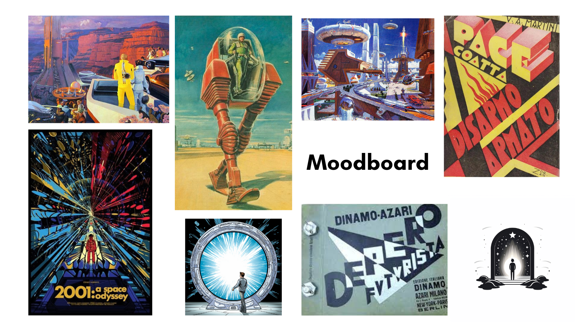
new technology, sold on safety and reach: it works, it is for everyone, it connects places.
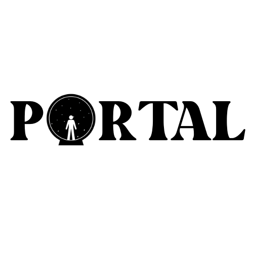
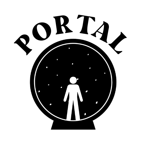
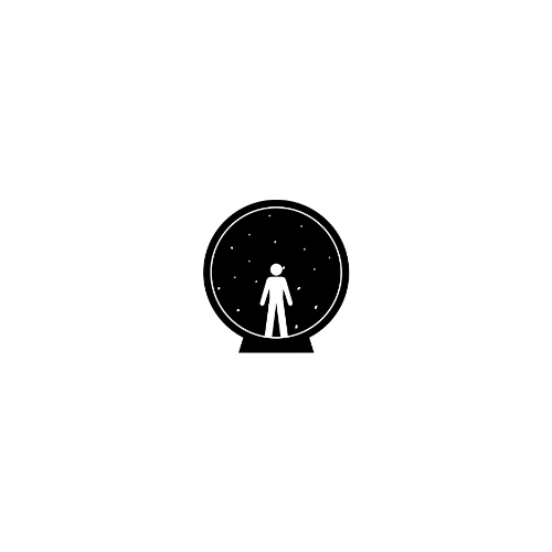
a figure inside a circular portal. four versions, from full lockup to favicon.

black, white and deep purple, with coral and gold as accents.
a display face for headers, a plain sans-serif for everything else.
confident and plain, with safety spelled out.
business cards, merchandise, and a poster.
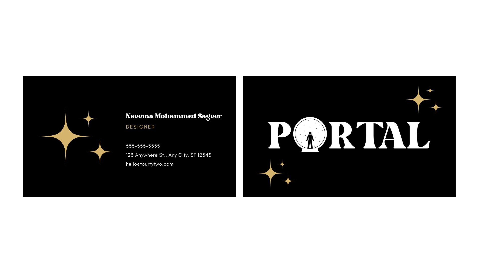
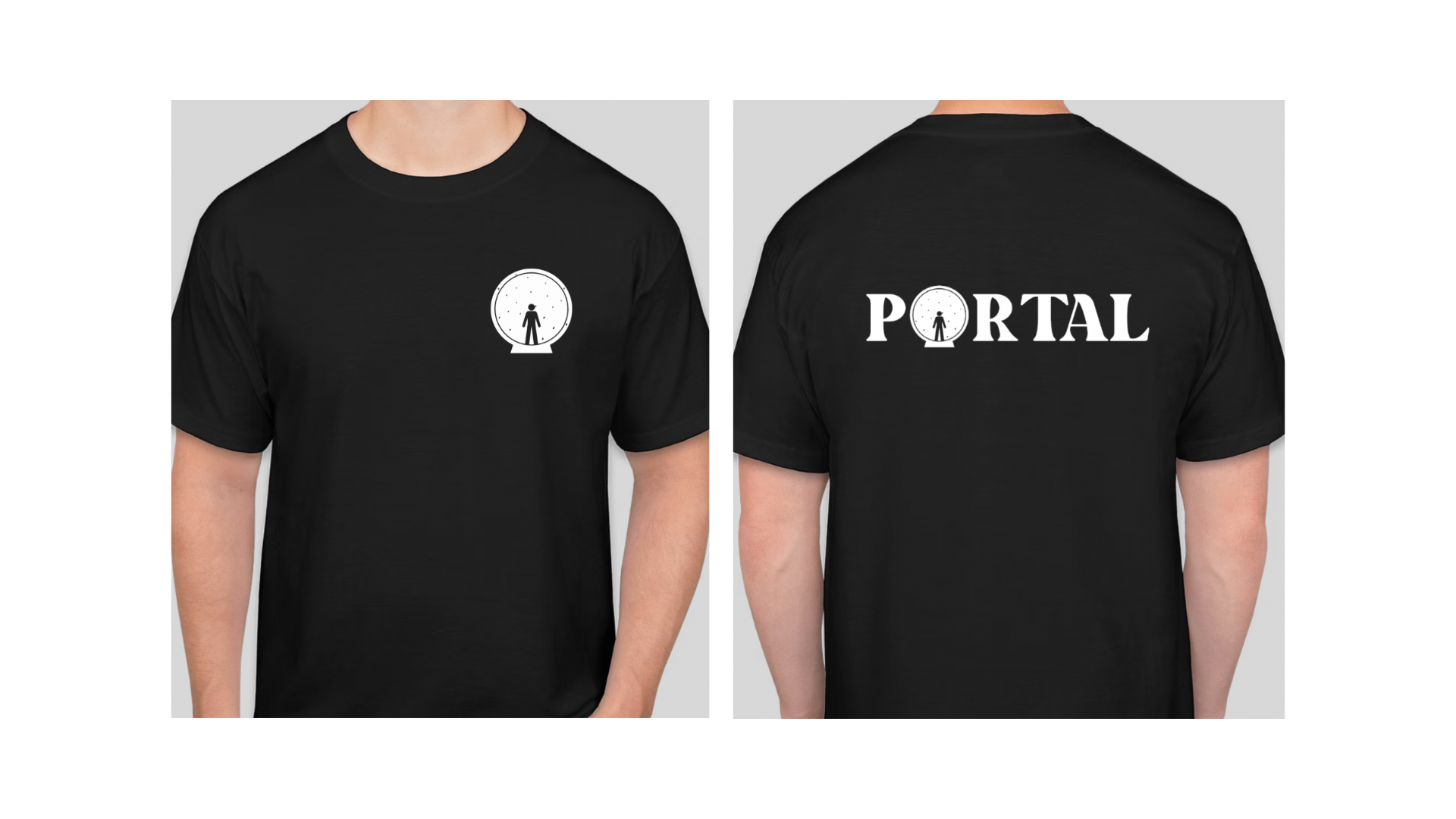
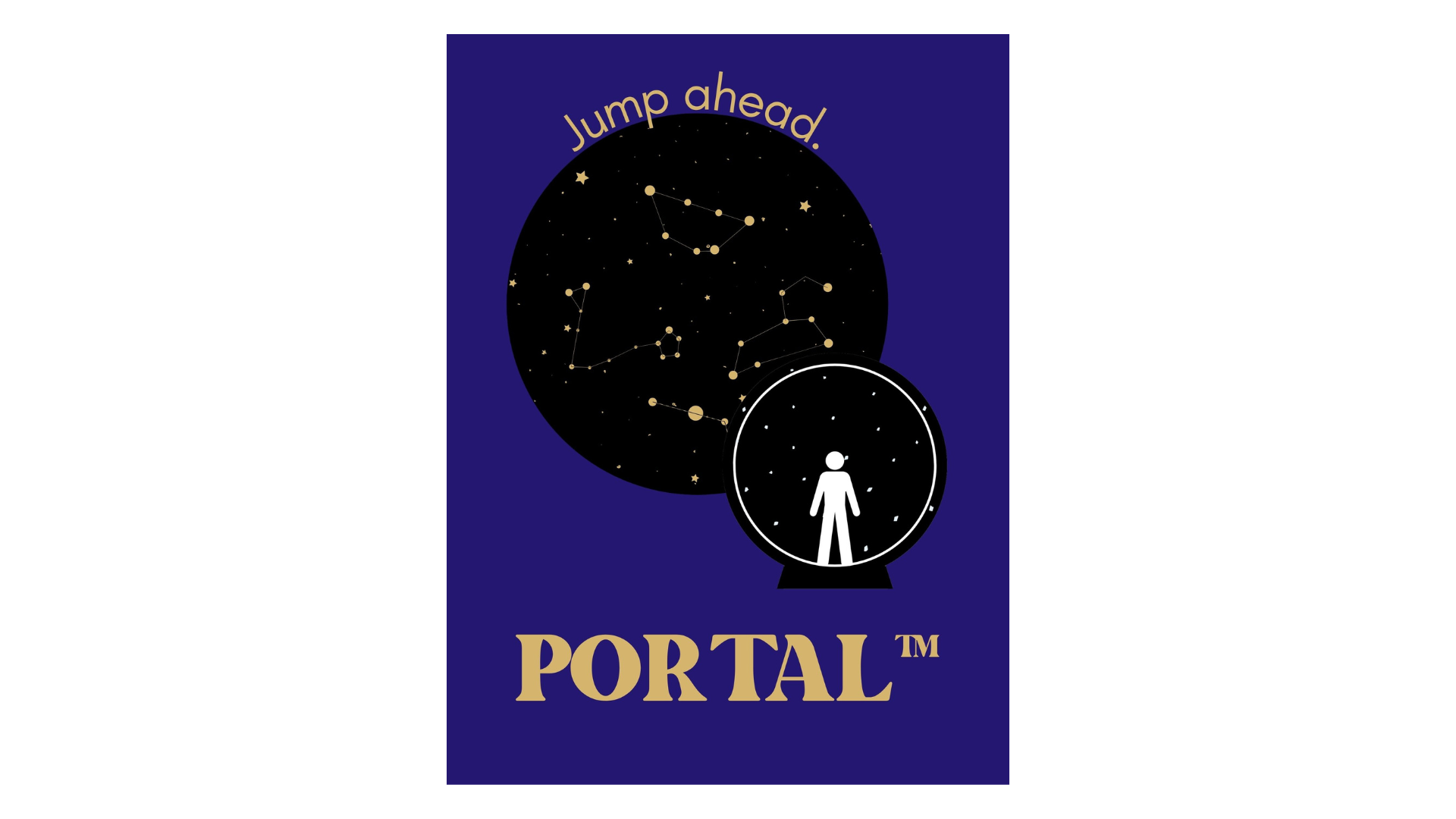
- researchretro-futurism, science fiction, and how current tech companies brand themselves.
- conceptseveral directions before the figure in the portal.
- systemlogo variations, palette, type, supporting graphics.
- applicationcards, merch, poster.
- the favicon is the full logo scaled down, so it loses definition at 16px. i would redraw it as a simpler mark.
- the palette has no neutral greys, which leaves nothing for small text or dividers, and coral on purple does not meet contrast guidelines. i would add a few purple-tinted greys.
- the identity still reads as sci-fi rather than a technology company people would trust with a trip. i am not sure yet what fixes that; if you have thoughts, i would like to hear them.
- the logo is placed and sized differently on each application. it needs a clear-space rule and a few fixed sizes.